Apple finally unified the iMessages experience in iOS 6, by allowing you to receive iMessages sent to your phone number even on your computer or iPad.
However… I'm still less then satisfied with iMessages on the mac… so much so that i won't use it at all… well almost… i might use it if i feel like spamming my friends with iMessages or something as a prank (since most of them don't have macs and will need to spend a considerably longer time typing on the puny iPhone screens). But yeah… i still don't like the new messages app for mac. And iPad.
Why?
I don't on my messages app on the mac all the time… but when i do, i want to see ALL my iMessage on the app. I don't want to see an empty screen with no idea where the last conversation went to. And i can't seem to find a way to force messages to download all my iMessage conversations… Even if you give me an option to load messages between a particular person (say the last 10 or last XX) it'll be great. Now i just open up an empty window with no idea who i last messaged and what we last talked about :X
The weird thing is that i can't seem to receive messages sent to my phone number on the mac even though its supposed to be unified o.o. No idea what I'm doing wrong or anything but…. the thing DID work on the iPad. I can also know iMessage to someone's phone number from the iPad… previously could only iMessage their email.
Another problem is that you can't seem to send out iMessages with your phone number from the iPad and mac… and this sucks cos that means you'll end up having two conversation threads on the other party's phone…. wonder if they'll change this? o.o
Or am i doing anything wrong here? No more updates available in the app store… tried signing in and out of my mac messages as well… wonder what's wrong? maybe i'll try again tmr.
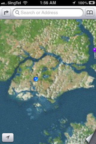
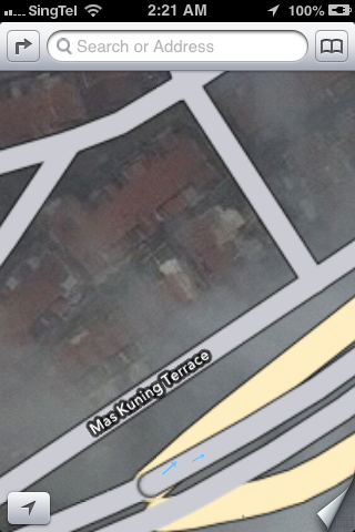
And ah the apple maps… the non satellite version seems good enough… but the satellite maps… were anything but pretty. Far short of the polish expected of apple… somehow i don't recall google satellite images to look so bad… check out these images… loads of joins between the satellite snap shots… and i wasn’t alone in feeling disappointed with apple's maps...
I sure hope the data quality will improve with time...
the very obvious joining of different satellite images… i know you can't take an image of the entire earth at once… but surely there's a better way to join the images…? or like… use images taken at more similar times…? Like… not have a part of the land so bright and the other so dark like this?
Or like this… :X
This is even worst… the picture quality on one side is so much worst. And nope, i waited a long time… it aint like this cos it isn't done loading. Also notice that the wifi loading circle thing at the top bar isn't there? Its done loading and this is how it is :X
on the other side… again, totally different colour and quality.
If you zoom out enough, the image looks ok though, no complains here.
Slightly more zoomed in images of SG looks ok… most of the time. Scrolling around i still see some joined parts though...
Now that's a lot of joints on this small screen...
The normal view looks ok though...
Except for the fact that i really want to see the buildings and HDB blocks in the map… and preferably with the blk numbers too. YES! Block numbers! AND BUILDINGS. Am I asking too much? I don't think so… i don't want to carry a huge street directory around… i want to just rely my smartphone...
And lastly the hybrid view...
At least you know that all those land around the road have buildings in them with this view… there's also the traffic that you can hide n show… but it aint seem to do anything at all… not sure if its cos the feature aint available for sg? or like the old google maps u have to wait an exceedingly long time? (i did wait long enough IMO)… or is there something that I'm missing? o.o Idk...
Well lastly… music on the iPhone got a makeover as well… new colour scheme of white, black, and ORANGE! No more blue highlights for the replay and shuffle buttons… its now ORANGE lol.
The track selection list is now WHITE
but now playing is black with orange play/shuffle buttons (when selected). The volume and what's that called… chaser? the timing selection thing… now features a pretty looking metal button.
Hmm… that's all the new stuff i discovered for now :P


No comments:
Post a Comment