Tuesday, December 25, 2012
Thursday, December 20, 2012
Happy Holidays!
Happy holiday peeps!
Going away on holiday from 21st to 26th Dec!
Family outing to genting and malacca…! Hmm if i aint too lazy i'll update with some photos when I'm back :P
CloudOn: Microsoft Office on the iPhone, Right Now | TIME.com
Now this is interesting! Downloading the app now! You should try it too... after all, its free so why not? ;)
Google Music’s Free Scan and Match Feature Comes to the U.S. | TIME.com
Google Music’s Free Scan and Match Feature Comes to the U.S. | TIME.com

Tsk tsk tsk... so google music is in the US... when will it come to Singapore? f3
Urban dictionary defines f3 as such (look at the 3rd definition), but that's not quite the way it is in MSEA… f3 is more like… 'diaoz' or 'dotzz'… like giving ppl the WTH look… which is a bit different from 'troubled' look IMO… sarcastic yes definitely. But troubled? No!
Saturday, December 15, 2012
The Really Interesting Thing About Google Maps Isn’t the App Itself | TIME.com
more competition is good. me likes XD
With iTunes 11.01 Update, Apple Fixes Several Serious Issues | TIME.com
i don't a big, or even a moderately big library... but i WAS noticing lags while searching in the search bar... not too much, but still very noticeable lags... just updated to the new version and the search is definitely a lot much better now :)
Friday, December 14, 2012
Problem Resolved: Google Maps for iPhone Is Here, Looks Good | TIME.com
haha... so those holding back on updating their iOS (if there's still any?) because of the maps can finally update it in peace now :P
Wednesday, December 12, 2012
Microsoft’s Surface: Coming Soon to a Best Buy and Staples Near You | TIME.com
yay, does this mean i'll soon get to see a surface tablet in sg stores too? I'd really like to try my hands on the tablet, esp the keyboards XD
Tuesday, December 11, 2012
Friday, December 07, 2012
Casio G-Shock: The Smartwatch Craze’s Less-Crazy Cousin | TIME.com
for a self confessed techie like me, i think wearable computing is a very exciting future... cant wait to see more of these smart watches come out... and of cos their price is always an issue :P
Thursday, December 06, 2012
Wednesday, December 05, 2012
Three Things Apple Didn’t Get Right in iTunes 11 | TIME.com
Interesting. Some stuff that i definitely wont notice. Since i've not bought a single track from iTunes yet for one... and i don't have 25 thousand songs... nor do i bother about putting in my album art. The album art thing is quite stupid though i must say...
Tuesday, December 04, 2012
iTunes 11
So iTunes 11 finally came out last week...
I've tried it out for a couple of days already, and as shocked as i was about the missing side bars right after i updated it, i got used to the new interface in a jiffy.


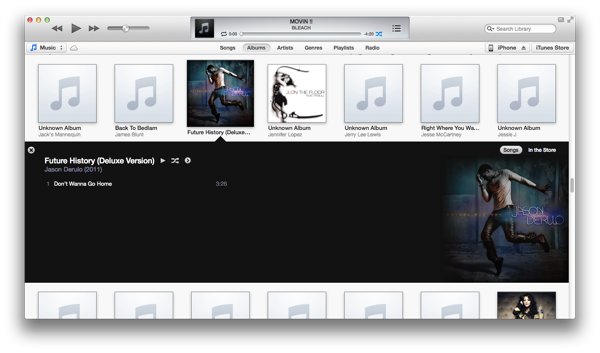
A huge thing that apple seems to be really proud of is the new album look. I, on the other hand, really hates looking at my songs through albums.


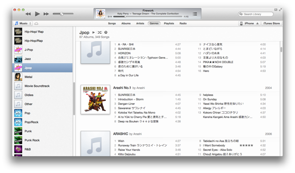
Plus… i mostly just have like… one or two songs from the whole album (with the exception of arashi of course)… so in short, my list of albums is in a terrible, terrible mess. I always only look at my song list (and i like to arrange it by date added…. i am strange? LOL)


Back to playing songs...


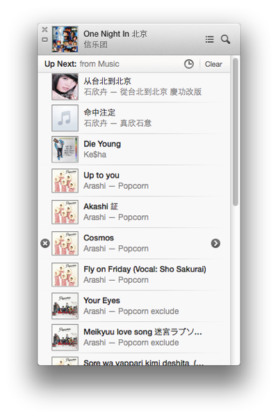
Something that got me really excited in the update is the ability to see what songs are coming up next, and change it...


One thing that really please me as well is that the new update didn’t break my application hotkeys in alfred XD
hmm…. that's about all about the new iTunes…
Overall? I think it looks very bright and clean. Very fresh looking. The best change for me would be the ability to see what songs are coming up next, or add songs to play next as i please… yup. It’s a nice update :)
The past and the future of famous logos | StockLogos.com
The past and the future of famous logos | StockLogos.com
very hilarious!
Nokia logo just disappearing... and the MS office logo was indeed pretty similar to what they eventually came up with...
the meteorite hitting the earth in the firefox logo was a nice little touch :P


